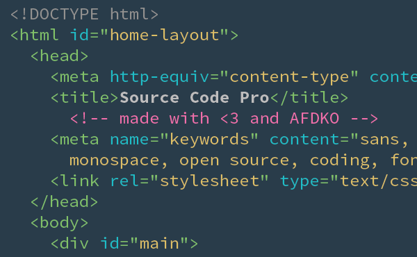
In September 2012, Adobe released its second open source (under the Open Font License 1.1) typeface family, Source Code Pro. This is a monospaced version of the first one, Source Sans Pro, and that’s significant because I’m always looking for a good, monospaced font I can use in my terminals. This one looked like a great option to try out, so I downloaded it and gave it a run. Below are the steps to manually install it via the command-line, and while this is in Ubuntu, Debian and other Linuxes should work the same way, but as always YMMV. So let’s get started.

<br/ >First up, we need to get the files
wget --output-document=/tmp/fonts.zip http://downloads.sourceforge.net/project/sourcecodepro.adobe/SourceCodePro_FontsOnly-1.017.zip
Now we need to unpack them
cd /tmp
unzip fonts.zip
Now we have a choice, we can install the fonts system-wide, or just for your user (if you don’t have sudo, or don’t want to install it system wide). First we’ll install it for the one user.
mkdir ~/.fonts
cp /tmp/SourceCodePro_FontsOnly-1.017/TTF/*ttf ~/.fonts
For system wide installation, we just need to copy the fonts to /usr/share/fonts, to remind yourself in the future that these were added we’ll put them in our own directory.
cd /usr/local/share/fonts
sudo mkdir myfonts
sudo cp /tmp/SourceCodePro_FontsOnly-1.017/TTF/*ttf myfonts
Lastly we have to run fc-cache to rebuild the font cache
fc-cache
You’ll need to close any terminals you have open, then reopen one. From here it may vary depending on what term you’re using, I use and recommend Terminator, so I just have to right-click, choose Preferences, hit the Profiles tab, uncheck the Use the system fixed width font box, and click on the font selector button below it. From here it’s up to personal preference, but I scrolled through all the font selections and tried a few before I finally ended up using Source Code Pro Semibold 9. The 9 point font is just about right for my 13” MacBookPro screen and while the characters seem a bit shorter, maybe more square than rectangle, they’re very readable, which is the key.